
Responsive Web Design in Koliseo

The best event interface can look like crap if it doesn't include awesome background images to get the point across. At Koliseo we are not shy of experimenting:
- Include videos in the event page: We did that in the early platform, but it looked awful when real people tried to use it.
- Short, tweet-like event descriptions: We wanted to keep descriptions brief and to the point, but this didn't really pass customer validation. That's why now we are enjoying long descriptions with rich text.
- Photo Carousel embedded in the event page: you know airbnb? Ours didn't look like that at all.
- Full-screen background images: this worked. Concretely, it worked and looked awesome.
Part of including an entire body of event description was making sure that the page still rocked on displays of any size. These days our users throw a variety of PCs, tablets and smartphones of all sizes to our website, and we wanted to be able to handle it. If we were to combine photos with event descriptions, we had two requirements:
- Use multiple resolution images to save bandwidth and display the page to the user as soon as possible. We do this combining three image sizes (small, medium and big) with standard responsive web design magic monkeys.
- Move the ticket form up as much as possible. Not really above the fold, but the closest we could.
- Continue looking awesome.
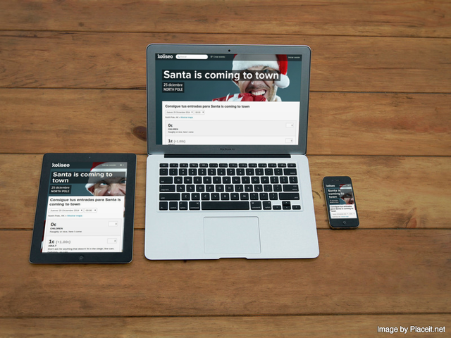
The result is a ticket purchase page that can handle Android, iPhone, tablets and PCs like a pro. It doesn't matter if that was your ultimate intention, but your ticket selling page will be ready to start kicking ass.
Man, developing for the web these days is an amazing experience.